As it has lots of images, this post may be too long for email - so please do have a look at it in your browser/app instead
This is what you have to bear in mind when dealing with a slope: when the garden drops away, what can you bring into the picture to create interest? Or perhaps your existing picture needs simplifying? When the ground instead rises up, how do you deal with that slope or that ugly blank retaining wall?
The sloping garden
The sloping garden is a space that never looks quite right from any angle.
Whether the garden drops away from the house or rises up in front of it, designing a sloping space can be a bit of a mind-popping exercise. This week we’re going to dive straight into this garden design challenge, as it’s a subject that readers have raised again and again. I’ll be taking you step by step through a case study, and addressing any questions you have about your own plot or project.
If you’re a new subscriber, WELCOME. Help yourself around the archive, have a good old poke around, and let me know what you enjoyed. You’ll soon discover that many of these articles are inspired by readers’ questions and requests, such as
And of course, there’s our weekly Sunday morning Show Us Your Plots on the Chat:
How does Show Us Your Plots work?
On Sunday morning you’ll see a post on the Chat which starts ‘It’s Sunday 15th September and it’s time to Show Us Your Plots!’ This is the opportunity for you to upload a photo of your garden, or of a green space nearby, or a flower - whatever you think you’d like to share with The Gardening Mind community.
I promise you, your photo doesn’t need to be wonderful or edited - honestly, you should see some of mine. It’s just an honest record of what’s going on in our own gardens, or a green spot near wherever we happen to be. Will you come and give it a go this Sunday?
The Chat also acts as a Gardener’s Question Time through the week - I used to post a monthly GQT feature, but on the Chat it has taken on a life of its own. So if you have ANY garden-related, plant-related query, come and join us!
Before we kick off, there’s still time to put your name in the hat for this ticket giveaway. This isn’t a paid ad: I was offered two tickets for this amazing day at Gravetye Manor, and it’s a fabulous opportunity.
There’s a talk with historic tulip specialist Polly Nicholson, and you get a copy of her new book. Also, there’s a chat with the Head Gardener Tom Coward, AND a three-course lunch in their Michelin-starred restaurant. The draw will take place on Saturday 14th at 2pm - good luck!
*EDITED* This competition has now ended and the winner has been notified. If you’d like to find out more about the event anyway, there’s more information here.
Sloping gardens - a case study
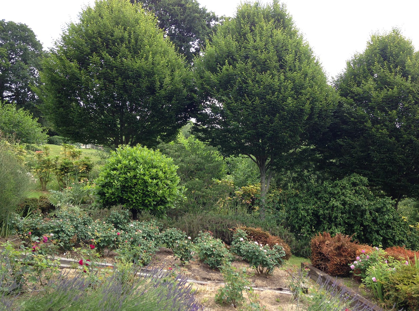
Here are a set of steps in the garden at Fairlight End in East Sussex. The photo on the left was taken from the top of the series of steps, whilst the one on the right was taken from the very bottom: as you can see, the view and the effect change completely.
This is what you have to bear in mind when dealing with a slope: when the garden drops away, what can you bring into the picture to create interest? Or perhaps your existing picture needs simplifying? When the ground instead rises up, how do you deal with that slope, or that blank retaining wall which holds up the ground as one level changes to another?
Curving, winding steps are a great way of dealing with level changes. Keep the steps simple - whatever you do, don’t make your garden design all about the steps. You want to use them, but they wont want to shout their existence. Creating a winding route, and edging each side with plants, creates that framing effect we looked at last week - can you see on the left-hand photo above how the shrubs populate the slope, anchoring the steps to the land and giving a sense of security as you walk down? The evergreen mound at the very foot of the steps acts as a punctuation, stopping the eye from zooming straight down the slope, but set to one side in order not to block the view completely.
Moving UP a slope, the planting creates a different effect. It blocks what lies above, but in a way that creates an atmosphere of mystery, leading you onwards and upwards, to an area where the planting opens up, creating a lightness which invites you towards it.
Notice how subtle both these sets of steps are. In beautiful and simple materials, using small units of stone held in by larger pieces of stone and then timber further up, they settle sensitively into the space.
What if the whole garden slopes in all directions? A case study
In a large garden, slopes create all sorts of problems. Just take a look at this ‘before’ image, where a previous owner had decided to slice across the contours of the land, filling the resulting stripes with topiary and ornamental flower beds. I really have no idea what was going through the mind of whoever made this, but I’m not complaining - this is my catnip: it’s exactly what makes my job as a garden designer so fascinating.
If you’ve previously taken part in the Small Garden Design course1, you’ll know the first thing I suggest to do when starting on a design is to make a study of what lies beyond the garden. So rather than being terrified by the rectangular blocks of hedging and the ornamental trees sitting in their own bare beds, I’m looking at that glorious landscape, that woodland, the contours of the land, and the fact that here we’ve got a network of houses and outbuildings that all need pulling together.
Let’s take a look at those contours. Here in the site survey, you can see the buildings at the bottom, and the contour lines travelling all the way down and to the right at the same time. You can also see those slices of beds and islands of specimen trees:
Can you see how angular all the introduced lines are? This was the view out from the kitchen window - there’s beauty in what lies beyond, yes, but what’s been introduced bears no relation to the landscape. There’s a row of fastigiate hornbeam which are lovely in themselves, but all they do is zoom us right down to the bottom.
The client gave me a free rein here, with just two requests to retain the square cloister of hornbeam just to the left of the tap, and also to keep the apple arch walkway whose blossom was a bee magnet.
The clients even agreed that I could reposition those beautiful hornbeam.
Looking across the garden, with the buildings all to the right, the slope here has been dealt with on the right by a stark brick wall which retains the garden of the guest house, with the barn beyond:
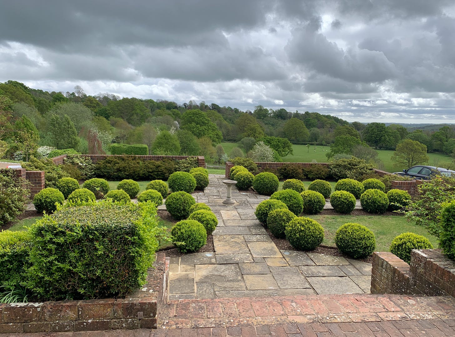
And in that guest house garden, we come to everything that is wrong about this design. Can you see what’s been done?
Uncompromising yew and box balls have been arranged in a suffocated pattern with no relation to the landscape. There’s no interest here, and no sensitivity to the location. There’s no feeling of being able to breathe. Plus, a great big wall had been built in order to stop people falling off at the end, but what it also does is slice across the landscape - a rude interruption rather than a subtle journey from one level to the next:
This imposition of hard landscaping had to go.
So what’s the plan?
With a sloping garden, ‘winding’ is the key to success. Imagine yourself negotiating these contours - would you want to walk straight down them, a walking downhill skiing race? It isn’t going to be a comfortable journey. A slalom on the other hand, is much more enjoyable way of travelling through the space.
This idea of weaving through the land inspired the whole design, and as you can see, there was actually more ’taking out’ than there was ‘adding in’. If I don’t see a need for something in the garden, I don’t add it. Whether you’re working with a designer or whether you’re designing your garden yourself, always question why elements are being introduced. Do they have a purpose or are they DFDS2 - if they really are just there for the sake of it, take them out.
The apple arch walkway and hornbeam cloisters are really hard to make work, but I felt that by working with the existing stream and removing a lot of the other clutter, that we could make these elements appear softer within the space.
The stream would be edged with planting and wildflowers, which would then extend into a meadow replacing all those stripes and lines of beds. Paths would wind and weave across the space and through the wildflower meadow planted with a meadow of blossoming fruit trees, and the hornbeams would be lifted and replanted:
Although this is a very large garden, certain areas can be taken as areas in their own right, and have solutions that can be applied to a smaller space. Here, that out-of-place guest house garden was to be replaced by a series of soft, curving, sloping beds, which then extend out and link with the house:
Let’s look at how this worked in reality:
That ugly topiary garden was the first thing that had to go. A terrace is still needed at house level; after that, everything else was removed, plants re-homed, and the levels were taken back the levels of the land.
Before getting to the big reveal and seeing how these plans worked in reality, here are some ‘in construction’ shots:
The planting beds are then laid out - even at this early stage, this is an improvement on those terrible bricks and balls. The idea, remember, is that you set your garden journey to weave around a sloping space, as opposed to having straight lines:
This concept continues through the main garden: wildflowers and flowers with a ‘wild’ feeling create a space that is now completely different in layout and atmosphere and effect. There are areas that are secluded, that only reveal themselves as you turn a corner. There are other areas that open up, visible from further away, and welcome you to come and explore them. This is how you can work a sloping space to your advantage - by harnessing the fact that a change of levels is itself a point of interest in a garden, by embracing this as well as the idea of curves, and by using subtle hard landscaping, you can create that atmosphere of romance and mystery that I keep banging on about.
So how do these ideas work in reality?
First of all, remember that view from the kitchen window, the masses of geometric flowerbeds and all those lonely trees in their empty circles of bare soil?
Here’s what that view looks like now:


