This week’s post has a lot of images and so may appear shortened in the email - please click on ‘View entire message’ and you’ll be able to view the entire post.
On a frosty winter morning, this is a view which brings me a lot of joy:
How this garden in Kent came about is what we’re talking about today, and first of all, we’re going to take a step way back in time. A step right back into 17th century Rome, in fact.
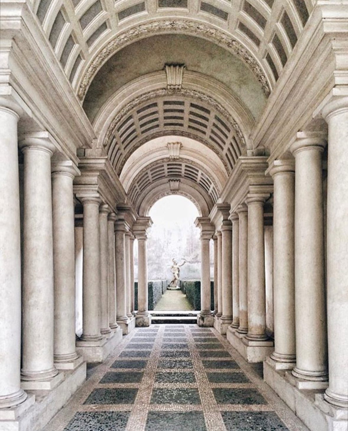
Behind Campo de Fiori in Rome, the Palazzo Spada, a baroque masterpiece perfected by Borromini, holds a little treasure hidden to one side of its entrance courtyard. Bought by Cardinal Spada in 1632, the building’s new owner wanted a this-is-quite-how-fabulous-I-am home in the eternal city, and in order to achieve the sumptuous baroque residence he longed for, he enlisted the services of Francesco Borromini, one of the go-to architects of the day.
Borromini’s stroke of genius1 was to give the building some elements that make it appear larger than it actually is, and the best example of this is the forced perspective gallery which sits just to one side as you enter the central courtyard. It’s a nook that you have to make a point of going right up to, as initially when you catch a glimpse of it, you assume it’s just a corridor off to another wing. But then you go up to it, you stand before it and you admire the life size statue at the end - if you have a very a sharp mathematical eye, you’d say the gallery was around 37 metres long, which is what Borromini’s calculations were.
You used to be able to walk the whole length of those 37 metres and go right up to the statue, where, DRUMROLL….
Yes - it’s all a lovely trick! The corridor is just 8 metres in length. The deceit is based on careful calculations and the decreasing height of the columns and the rising level of the floor. The statue at the far end is only 80cm tall.
So, what has this got to do with the garden you see at the top of this Design How-To?
Well, around 15 years ago I went to meet some new clients who had just moved into a barn in a middle of a field. These clients, still clients today and most importantly friends, indulged me and my imagination, and let me play about with this idea in a corner of a large new walled garden which needed a bit of something fun going on in order to stop it being just another walled garden. More of that later.
You can read about this garden in this month’s Country Life, and you can find more photos here:
A garden often has to do a lot of heavy lifting - helping to make a house seem comfortable in the landscape; bringing together disparate elements; hiding or enhancing views; and providing protection from prevailing winds. At Standen Barn in Kent, all the above was required of five acres of flat, open field. The 15th-century black-timbered barn had only stood there since the 1990s and, with its narrow apron of paving, looked out of kilter with its surroundings, so even before there could be any detailed discussion about what kind of garden the owners wanted, there was much that required careful consideration
Tiffany Daneff for Country Life
This is the view that greeted me as I travelled up the drive on that day fifteen years ago: a house, a home, desperately needing a home of its own. It seemed to hover above the place it has been plopped into, needing an anchor and a reason to be.
Going inside and taking a look out of those tall windows in the centre of the building, I could see nothing apart from a hedge which delineated this space as a garden, in the sense that it needed to be a place to be. There’s a majestic oak tree, framing underneath it an ugly view of a neighbouring house which you can just spot here. It was clear that I needed to both block and celebrate this one grand view, to make something of it which would distract and be of that right scale to work with the imposing size of the house. The tiny terrace was indeed clearly tiny, but if I were to push it out and leave the grass bare in front of it, it would simply draw attention to hard landscaping which then in turn would link to the hard materials of the ugly building ahead which needed to be blocked in the first place.
I’ve been digging around in boxes for plans and notes: everything at that stage was hand-drawn, so I’ve translated my initial site study sketch and almost indecipherable scribbles and squiggles into something a little more comprehensible:


