A garden design how-to
How to design a family garden in the heart of the city. Plus: dealing with those RHS Chelsea Flower Show nerves, and the Small Garden Design Course
As it has lots of images, this post may be too long for email - so please do have a look at it in your browser/app instead. Thank you for liking it by pressing the ❤️ button
The point isn’t to imagine a parallel universe in which things were easy, but to raise the possibility that they might in fact be easy, here and now
Right - we’re properly into the New Year
And that means a bumper edition of The Gardening Mind. One to settle into if it’s chilly where you are. Or to read in the garden if you’re one of our southern hemisphere friends…. I love the fact that a reader commented that reading The Gardening Mind was keeping her cool in Perth, Australia’s 43° this week.
If you’re a new subscriber, WELCOME. Help yourself around the archive, have a good old poke around, and let me know what you enjoyed. You’ll soon discover that many of these articles are inspired by readers’ questions and requests, such as
how to deal with a garden that isn’t really much of a garden at all
How to choose the right plants for your border, and my secret trick in planting design
Some quick reminders:
After the requested Christmas break, the Small Garden Design Course is starting again for paying members of The Gardening Mind, so whether you’re new here or whether you’d like to have another go, or whether you’re simply interested in dipping in and out, look out for updates. You can start any time and you can find everything here.
Diary date for our members’ Zoom get-together, which is really a fun general catch-up about small garden design questions, as well as the chance to ask questions about how to use The Gardening Mind - it’s on Sunday 12th January at 6pm UK time.
Come and join in the weekly ‘Show Us Your Plots’ where we all share photos of green spaces wherever we may be - on Sunday morning you’ll see a post on the Chat which starts ‘It’s Sunday 5th January and it’s time to Show Us Your Plots’
An icy start
It’s icy here and after putting out food for the birds, I’m back inside, leafing through the seed and summer bulb catalogues, writing to you, and making plans. Spring seems so far away but, it’ll be here an instant. I’m going to stick my neck out and predict that January won’t seem nearly as long as it did last year - remember when we got to about the 85th of January in 2024 and it STILL wasn’t over?
I don’t know why I’m thinking like this. Maybe it’s the blue skies as I’m writing. Maybe it’s because Christmas was on a Wednesday. Maybe it’s because of the flowers that are already growing inside and the buds of the bulbs poking through outside. On the subject of indoor bulbs, I thought nothing could beat the beauty of the first amaryllis to flower, but look at this beauty:
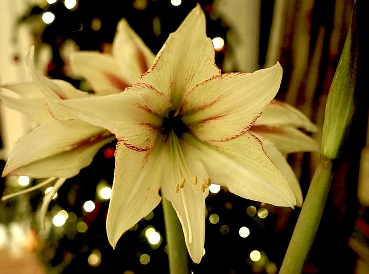
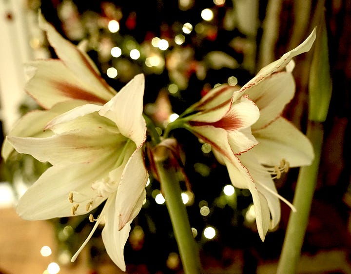
It’s called ‘Magic Green’. It’s elegant, fabulous and understated all at the same time. It’s tall, too: on top of a 3-foot stem are parchmenty-ivory trumpet-shaped flowers with a hint of green. The petals are delicately edged in cerise-red, and this red is even more stunning as a detail on the reverse of the petals. It’s just WOW.
I grew these in water, so I dont think they’re going to flower again next year. For annual flowering, they really should be grown. in compost: I’ve gone though the whole process of caring for your amaryllis bulb over the year here.
Maybe the optimistic short-January feeling is because I’ve got a deadline for the first portion of my next book (not The New Romantic Garden which is all ready and waiting please to be pre-ordered here. If you’re wondering why I keep mentioning this, it’s because pre-orders really help - just like liking this post helps, a pre-order means very good things for a book. The more pre-orders it has, the more it goes up the charts and then the booksellers see these charts and they order copies for the shops…..)
Or maybe the optimism is because of the mindset I’m going into this year with. No resolutions, but instead approaching tasks with a ‘What if it were easy’ mindset, inspired by Oliver Burkeman.
The point … isn’t to imagine a parallel universe in which things were easy, but to raise the possibility that they might in fact be easy, here and now.
…The irony of what’s going on here is that this prospect – that something meaningful might prove easier than you imagined – can itself be a source of discomfort. Many of us were apparently raised to believe not just that important things can feel difficult (they can!) but that they must feel difficult; that the measure of accomplishment is how much effort it took. And, moreover, that effort is a measure of self-worth — that if an achievement comes easily to you, you must somehow be cheating, or that you just got lucky.
It feels somehow illicit to consider the alternative: that you might already have all it takes ...1
2025 is a big old year and it could be a daunting one: creating a garden for the RHS Chelsea Flower Show is something that could take me over completely - in fact it does take over if I let it. If you’ve ever seen actors throw up before they go on stage, that’s how it feels right now whenever I think about making this show garden. The other day a cousin was asking me about this year’s garden and I had to leave the room…
So why do it?
I’ve always said Chelsea is my marathon, my Everest. I’m never going to run a marathon or climb an extreme mountain, but it really feels like the amount of mental effort for all of these is the same. But this year, it’s even more than that. When The Glasshouse approached me to ask if I’d consider designing a garden to highlight their work, even though I’d sworn I’d never do Chelsea again for all the reasons above and and more which I’ll be revealing over the next few weeks, I couldn’t say no to them.
An incredible social enterprise
Women prisoners, often serving sentences because of something they’ve done because a male partner has asked them to do it, have way more chance of leading a successful life after release if they have been lucky enough to have some kind of training whilst in prison
As a social enterprise offering second chances through horticultural training to women based in UK prisons, their work is incredible - and having visited the prison and knowing where the garden is going to be relocated after the show, I’m even more determined that this garden should create a conversation about rehabilitating prisoners. Women prisoners, often serving sentences because of something they’ve done because a male partner has asked them to do it, have way more chance of leading a successful life after release if they have been lucky enough to have some kind of training whilst in prison. There has been ZERO re-offending amongst the women who have completed The Glasshouse programme - don’t you think that says a lot?
That’s why I’m doing it, and although I could feel daunted at the prospect of bringing into reality the garden in my mind, in the space of just 19 days, for it then to be scrutinised and judged, I’ve decided not to let this ‘being daunted’ happen. For the more I talk about it, the more I realise that I’ve let the judging part of the process become a monster in my mind, a demonic dragon breathing over the whole thing. This is bonkers. This is not why I’m creating this show garden. It shoulnt’t be why we create a show garden. What I am doing is creating a garden for people to look at and enjoy, to give ideas and inspire and to introduce people to an amazing social enterprise. So yes, I’ll work my hardest and give it my all, but I’m not going to overthink the medal part.
As a judge myself, I know exactly what the judging process involves. It’s a robust process, and I am so proud to be part of something I hugely respect. As a designer though, just because I’m happy that my design does the job it sets out to do, it doesn’t necessarily mean the judges will come to the same conclusion when they assess it against the criteria that determine what level of medal it should get. (You can read more about Demystifying Judging here). Therefore, I’m channeling Oliver Burkeman, seeing the task as possible, and whatever else happens, happens. I can’t control that. What I can control is the impact that can be created by one of these show gardens, seemingly impossible to make.
Plans are afoot
We start building this garden at the end of April, and plans are very definitely in action. We’ve found the trees after trips to nurseries, where I got very distracted by this magnificent wisteria:
Yes, it’s in a pot - you can actually buy it like this and have it delivered to your garden….
The herbaceous perennials are all potted and ready to burst into action again in the spring, the annuals have been sown and are making their way through the soil.
I’m off to Italy to look at some very special furniture for the pavilion, whose final details are being worked on by the architects and us. We’ve been designing this pavilion since October 2023 - we need to make sure it’s a fully-functioning garden room fit for the purpose it’s being built for: a place at the prison for the women to sit in, either with colleagues, with a counsellor, or by themselves. It’s critical that these show gardens have a life after Chelsea, and I’ve insisted since my first garden in 2009 that every garden I design be relocated. The ramifications are huge - you can see later in this post what happened when one of them was rebuilt.
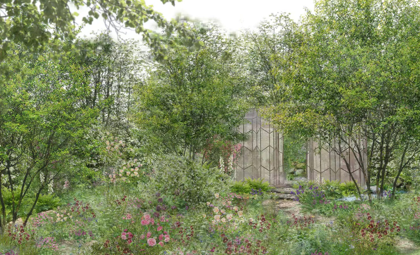
I’m super-excited to share more with you about the garden details - last month I almost cried with happiness when I saw the maquettes (models) for the garden seating, and I’ll be sharing more details with you about these soon. That’s the thing about Chelsea gardens: no designer wants to reveal their hand straight away. and that’s why these details trickle out over these next few weeks. There’s a lot to share and honestly I don’t know where to start. Actually - I think I do. Planting design combinations inspired by roses and their Strong Beauty - look out for these next week.
Small Garden Design - a case study
It’s time for a case study. If you’re taking part in the Small Garden Design sessions, you might already be able to guess how I went about tackling this long garden in the middle of London.
One of the things we’ve been really getting up close to in these sessions is the idea of getting to know the space as it is, before embarking on any design. It’s completely natural to want to get going straight away, but I urge you to fight the urge, if you can bring yourself to do so. I absolutely need to go through this process of familiarisation; it gives me time to absorb what’s going on.
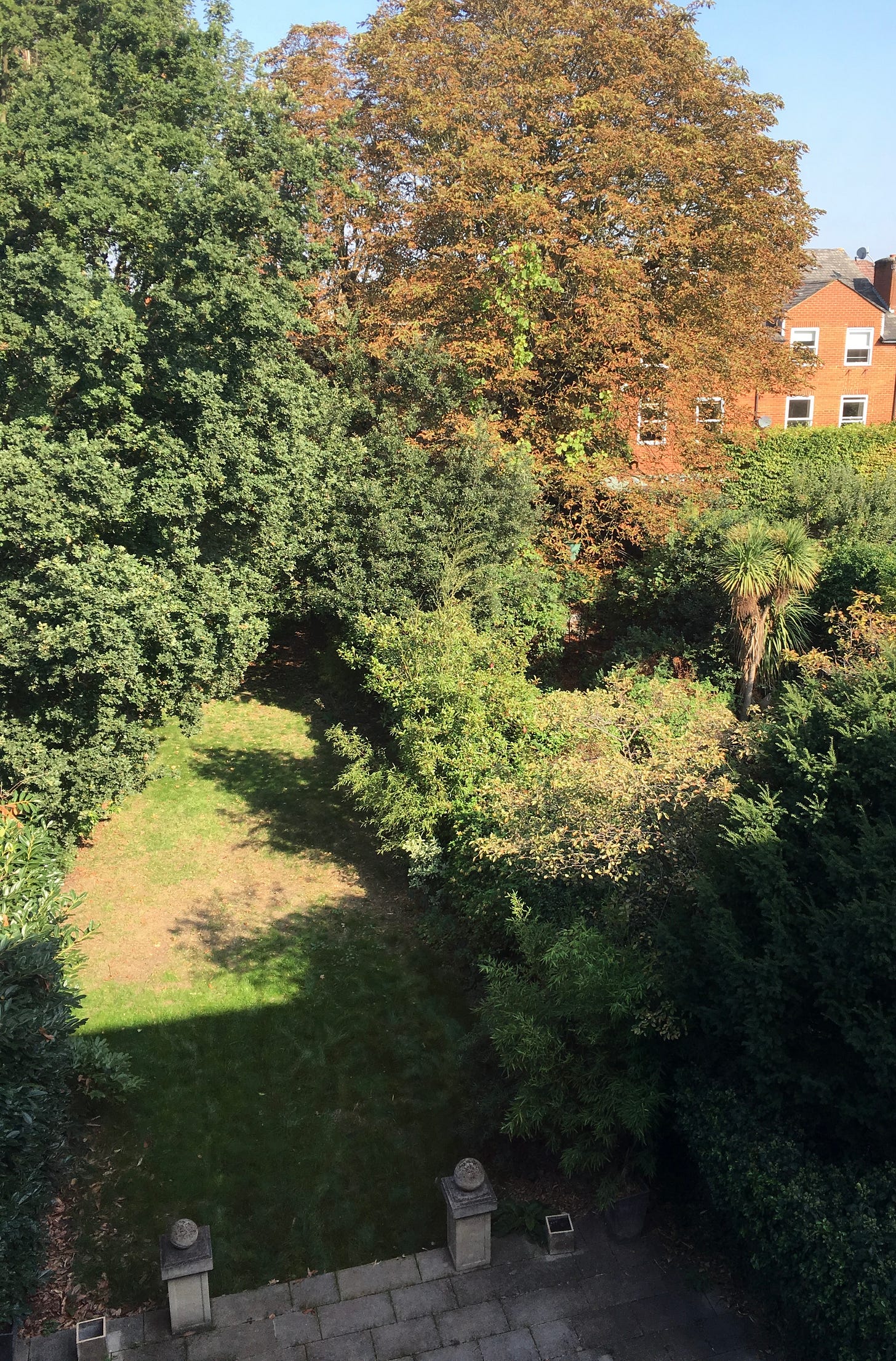
Here’s how the garden looked before:
In London, this beautiful house was being completely redesigned and reconfigured internally. The garden had nothing significant about it, apart from its size, which is pretty good for anywhere, and for London in particular. It consisted of a long rectangle of grass, with enormous overgrown hedges and huge trees along the boundaries. There were no interesting garden features, and the end of the garden was completely overgrown and unusable. The garden is 47 metres long and 11 metres wide, and the wish-list of actual items was small: a play structure, a dining terrace, and beautiful planting. That was it.


